案例11:基于相似性的剩余寿命估计
本案例将展示出构建剩余寿命估计的完整工作流,包括数据预处理、选择趋势特征、通过传感器融合构建健康因子、训练剩余寿命估计模型并评估模型预测能力。本案例使用的数据来自PHM2008的挑战赛数据,可通过以下NASA的链接下载本数据集https://ti.arc.nasa.gov/tech/dash/groups/pcoe/prognostic-data-repository/
第一步:数据准备
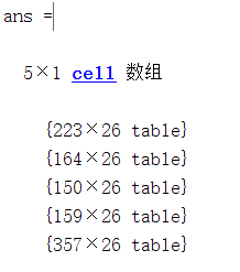
由于本数据集较小,因此可以将整个数据集都导入到内存中。之后可以通过helperLoadData辅助函数将训练数据文件中的数据导入到timetable型的cell数组中。训练数据包含了218条运行至失效的模拟数据,测量数据的组合被称为集成数据ensemble
helperLoadData辅助函数如下:
function degradationData = helperLoadData(filename)
% Load degradation data from text file and convert to cell array of tables.
%
% This function supports the Similarity-based Remaining Useful Life
% Estimation example. It may change in a future release.

% Copyright 2017-2018 The MathWorks, Inc.

% 导入文本数据为table
t = readtable(filename);
t(:,end) = []; %忽略数据的最后一列,因为它们都是空的''

% 添加列标签
VarNames = {...
    'id', 'time', 'op_setting_1', 'op_setting_2', 'op_setting_3', ...
    'sensor_1', 'sensor_2', 'sensor_3', 'sensor_4', 'sensor_5', ...
    'sensor_6', 'sensor_7', 'sensor_8', 'sensor_9', 'sensor_10', ...
    'sensor_11', 'sensor_12', 'sensor_13', 'sensor_14', 'sensor_15', ...
    'sensor_16', 'sensor_17', 'sensor_18', 'sensor_19', 'sensor_20', ...
    'sensor_21'};
t.Properties.VariableNames = VarNames;

% 根据id,将数据分为不同的时序数据存入table中,并将table数据组合成cell数据
IDs = t{:,1};
nID = unique(IDs);
degradationData = cell(numel(nID),1);
for ct=1:numel(nID)
    idx = IDs == nID(ct);
    degradationData{ct} = t(idx,:);
end
end
导入数据:
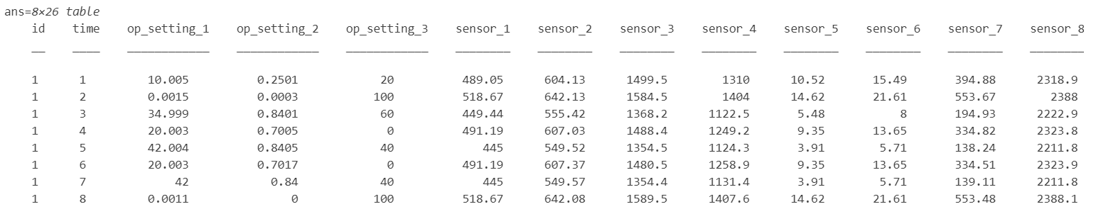
每个集成数据中的元素都是一个table,包含了26列数据,列分别表示机械ID、时间戳、3种操作工况量、21种传感器测量量,如下:
接下来,将退化数据划分为训练数据集和验证数据集,以便验证模型表现
rng('default')  % 设置随机种子
numEnsemble = length(degradationData);
numFold = 5;
cv = cvpartition(numEnsemble, 'KFold', numFold);  % 划分训练-验证集
trainData = degradationData(training(cv, 1));
validationData = degradationData(test(cv, 1));
为变量分组
varNames = string(degradationData{1}.Properties.VariableNames);
timeVariable = varNames{2};  % 第2列为时间戳
conditionVariables = varNames(3:5);  % 第3-5列为工况量
dataVariables = varNames(6:26); % 第6-26列为传感器测量量使用辅助函数helperPlotEnsemble可视化查看集成数据中的一组数据
辅助函数为:
function helperPlotEnsemble(ensemble, TimeVariable, DataVariables, nsample, varargin)
% HELPERPLOTENSEMBLE Helper function to plot ensemble data
%
% This function supports the Similarity-based Remaining Useful Life
% Estimation example. It may change in a future release.

% Copyright 2017-2018 The MathWorks, Inc.

% 集成数据为矩阵、时间表或表格的cell型数组
randIdx = randperm(length(ensemble));
ensembleSample = ensemble(randIdx(1:nsample));
numData = length(DataVariables);
for i = 1:numData
    data2plot = DataVariables(i);
    subplot(numData, 1, i)
    hold on
    for j = 1:length(ensembleSample)
        ensembleMember = ensembleSample{j};
        if isa(ensembleMember, 'double')
            % 时间变量和数据变量为double型
            if isempty(TimeVariable)
                plot(ensembleMember(:, DataVariables), varargin{:})
            else
                plot(ensembleMember(:, TimeVariable), ensembleMember(:, DataVariables), varargin{:})
            end
            xlblstr = "time";
            ylblstr = "Var " + data2plot;
        else
            % 集成数据中的元素为table型
            plot(ensembleMember.(char(TimeVariable)), ensembleMember.(char(data2plot)), varargin{:})
            xlblstr = TimeVariable;
            ylblstr = data2plot;
        end
    end
    hold off
    ylabel(ylblstr, 'Interpreter', 'none')
end
xlabel(xlblstr)
end
nsample = 10;
figure
% 仅画出10组数据中的前2个工况量和传感器测量量
helperPlotEnsemble(trainData, timeVariable, ...
[conditionVariables(1:2) dataVariables(1:2)], nsample) 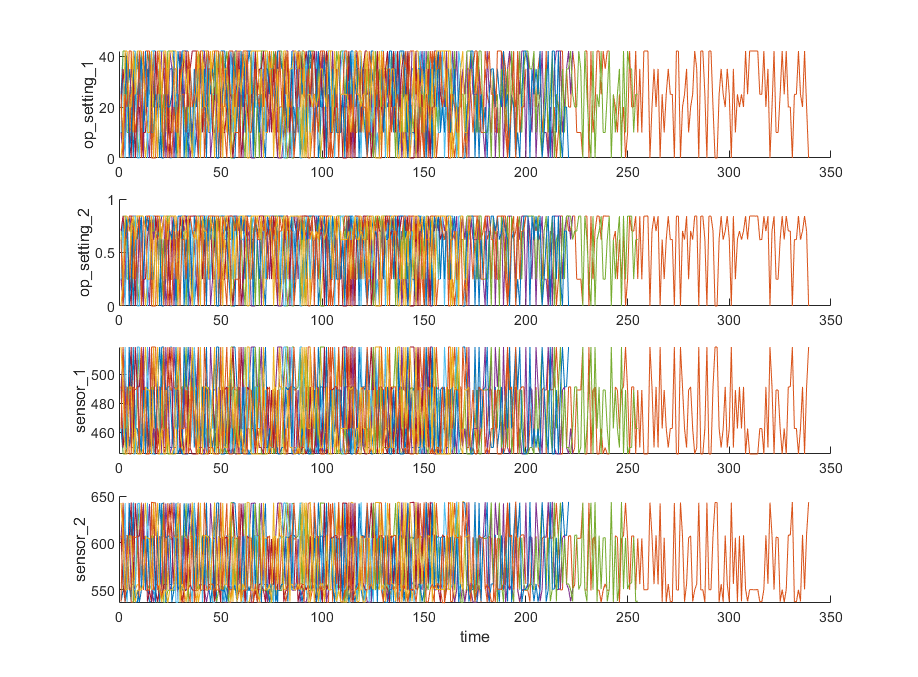
从图上可以看出,仅凭图中的信息完全看不出传感器的变化趋势
第二步:按工况聚类
本节中,将从原始的传感器数据中根据运行工况提取清晰的退化趋势
注意到,每个集成数据中的元素都包含了三个工况量,”op_setting_1“、”op_setting_2“、”op_setting_3“。首先可以将每个元素中的所有量提取出来并组合成一个新的table
trainDataUnwrap = vertcat(trainData{:});  % 包含所有量
opConditionUnwrap = trainDataUnwrap(:, cellstr(conditionVariables)); % 仅包含工况量之后借助辅助函数helperPlotClusters将操作工况量画成3D散点图,从图中可以清晰地看出所有数据呈现出6种不同的操作工况,并且每种工况中的样本点都聚拢得非常紧
helperPlotClusters辅助函数如下:
function helperPlotClusters(X, idx, C)
% HELPERPLOTCLUSTER Helper function for cluster plotting
%
% This function supports the Similarity-based Remaining Useful Life
% Estimation example. It may change in a future release.

% Copyright 2017-2018 The MathWorks, Inc.

if(nargin>1)
    hold on
    for i = 1:max(idx)
        scatter3(X{idx==i,1}, X{idx==i,2}, X{idx==i,3});
    end
    scatter3(C(:,1),C(:,2),C(:,3), 'x', 'MarkerFaceColor', [0 0 0], ...
        'MarkerEdgeColor', [0 0 0], 'LineWidth', 2);
    legendStr = ["Cluster "+(1:6), "Centroids"];
    legend(cellstr(legendStr), 'Location', 'NW');
    hold off
    view(-30,30)
    grid on
else
    scatter3(X{:,1}, X{:,2}, X{:,3});
end
xlabel(X.Properties.VariableNames{1}, 'Interpreter', 'none')
ylabel(X.Properties.VariableNames{2}, 'Interpreter', 'none')
zlabel(X.Properties.VariableNames{3}, 'Interpreter', 'none')
end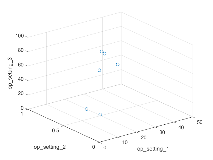
之后可以使用聚类的方法自动定位这6簇聚类。此处使用K-Means聚类算法,作为最流行的聚类方法之一,K-Means算法会导致局部最优。因此为避免这种情况的出现,我们可以多次运行该算法,并每次设置不同的初始点。本案例中,我们运行了5次该算法, 最后得到的结果都相同
opts = statset('Display', 'final');
[clusterIndex, centers] = kmeans(table2array(opConditionUnwrap), 6, ...
    'Distance', 'sqeuclidean', 'Replicates', 5, 'Options', opts);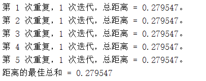
之后同样使用辅助函数helperPlotClusters,可视化得到的聚类中心和聚类结果
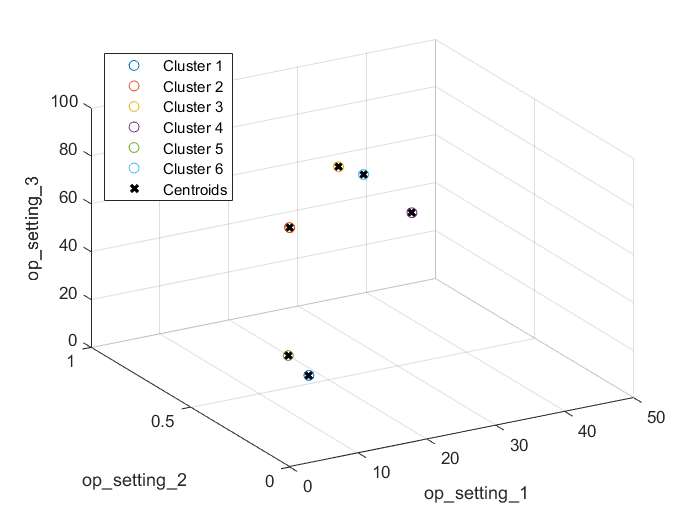
绘图显示,聚类算法成功识别出了这6种不同的操作工况
第三步:按工况归一化
接下来,按照上一节中识别到的不同工况类型,进行传感器数据的归一化处理。首先按照样本被划分的聚类类型计算不同类型下传感器数据的均值和标准差
centerstats = struct('Mean', table(), 'SD', table());
for v = dataVariables
    centerstats.Mean.(char(v)) = splitapply(@mean, trainDataUnwrap.(char(v)), clusterIndex);
    centerstats.SD.(char(v))   = splitapply(@std,  trainDataUnwrap.(char(v)), clusterIndex);
end
centerstats.Mean

每种操作工况类型下的统计数据可以被用来归一化训练数据。对于集成数据中的元素而言,提取每一行数据的操作工况数据,并计算其到6个聚类中心的距离,并依次找到它对应聚类簇。然后,用传感器测量量减去该簇对应的传感器均值并除以其对应的标准差(z-score归一化)。如果某簇中某传感器测量量的标准差为0,则将对应的传感器数据归一化结果都设置为0,因为这表明该传感器对应的测量值为恒定,而恒定的测量值对估计寿命没有帮助
下面,使用辅助函数regimeNormalization归一化数据
function data = regimeNormalization(data, centers, centerstats)
% 根据数据簇类的归属进行归一化处理
conditionIdx = 3:5;
dataIdx = 6:26;

% 对每一行操作
data{:, dataIdx} = table2array(...
    rowfun(@(row) localNormalize(row, conditionIdx, dataIdx, centers, centerstats), ...
    data, 'SeparateInputs', false));
end

function rowNormalized = localNormalize(row, conditionIdx, dataIdx, centers, centerstats)
% 对每一行归一化

% 获得工况和传感器数据
ops = row(1, conditionIdx);
sensor = row(1, dataIdx);

% 找出离样本点最近的簇中心
dist = sum((centers - ops).^2, 2);
[~, idx] = min(dist);

% 将传感器数据根据其簇类的均值和标准差归一化
% 将NaN和Inf值都设定为0
rowNormalized = (sensor - centerstats.Mean{idx, :}) ./ centerstats.SD{idx, :};
rowNormalized(isnan(rowNormalized) | isinf(rowNormalized)) = 0;
end使用之前的辅助函数helperPlotEnsemble可视化归一化后的数据,此时某些传感器的退化趋势可见
figure
helperPlotEnsemble(trainDataNormalized, timeVariable, dataVariables(1:4), nsample)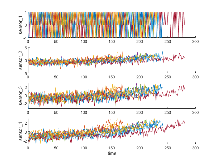
第四步:趋势分析
下面,从所有的传感器中选出趋势最明显的几个用来构造预测剩余寿命的健康因子。对每一种传感器,用线性退化模型估计它们,并根据模型的梯度排序出最重要的几种传感器
numSensors = length(dataVariables);
signalSlope = zeros(numSensors, 1);
warn = warning('off');
for ct = 1:numSensors
    tmp = cellfun(@(tbl) tbl(:, cellstr(dataVariables(ct))), trainDataNormalized, 'UniformOutput', false);
    mdl = linearDegradationModel(); % 创建模型
    fit(mdl, tmp); % 训练模型
    signalSlope(ct) = mdl.Theta;
end
warning(warn);
之后按照传感器模型的梯度绝对值排序,并选出最具有趋势的8种传感器
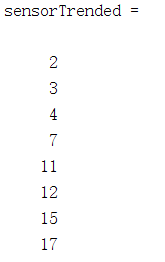
借助辅助函数helperPlotEnsemble可视化所选传感器的测量值
figure
helperPlotEnsemble(trainDataNormalized, timeVariable, dataVariables(sensorTrended(3:6)), nsample)  % 使用8种传感器种的第4,7,11,12号传感器画图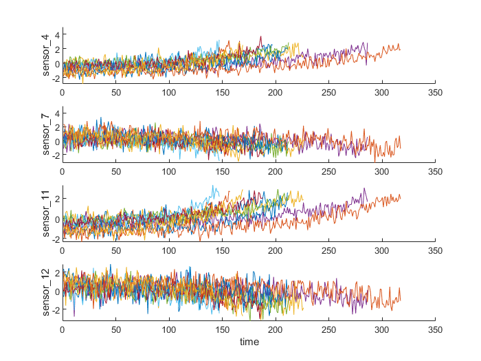
可以看到,有些传感器呈现正梯度趋势,有些呈现负梯度趋势
第五步:构造健康因子
本节聚焦如何将传感器测量值融合成一个单一的健康因子变量,然后基于该健康因子变量训练相似性模型
假设所有运行至失效的数据始于健康状态。然后将健康状态下的健康因子设定为1,将失效时的健康因子设定为0。同时健康因子随时间线性地从1退化到0。改线性退化将用来融合传感器值,更多精巧的传感器融合技术可以参考文献19202122
for j=1:numel(trainDataNormalized)
    data = trainDataNormalized{j};
    rul = max(data.time)-data.time;  % 计算每个样本点的RUL
    data.health_condition = rul / max(rul);  % 将每个样本点的RUL折算到HI中
    trainDataNormalized{j} = data;
end
可视化健康因子
figure
helperPlotEnsemble(trainDataNormalized, timeVariable, "health_condition", nsample)
可以看出,所有的传感器以不同的退化速度从健康因子为1退化到0
现在使用选出来的最具有趋势性的传感器值作为自变量,拟合得到健康因子的线性回归模型,方程如下:
HealthCondition ∼ 1 + Sensor2 + Sensor3 + Sensor4 + Sensor7 + Sensor11 + Sensor12 + Sensor15 + Sensor17
trainDataNormalizedUnwrap = vertcat(trainDataNormalized{:});

sensorToFuse = dataVariables(sensorTrended);
X = trainDataNormalizedUnwrap{:, cellstr(sensorToFuse)};
y = trainDataNormalizedUnwrap.health_condition;
regModel = fitlm(X,y);
bias = regModel.Coefficients.Estimate(1)
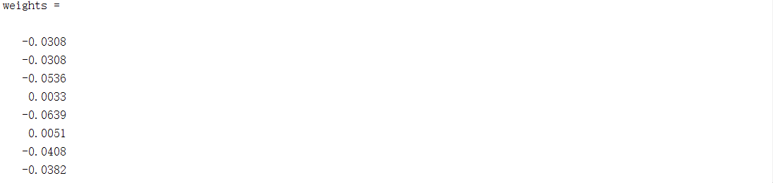
之后通过将传感器值乘上对应的权重构造出单一的健康因子
使用到的辅助函数degradationSensorFusion如下:
function dataFused = degradationSensorFusion(data, sensorToFuse, weights)
% 将测量值和权值相乘得到融合的健康因子值,同时做平滑处理并设定offset为1,使得健康因子从1开始

% 根据权重融合数据
dataToFuse = data{:, cellstr(sensorToFuse)};
dataFusedRaw = dataToFuse*weights;

% 使用移动平均平滑化处理融合数据
stepBackward = 10;
stepForward = 10;
dataFused = movmean(dataFusedRaw, [stepBackward stepForward]);

% 数据的offset设定为1
dataFused = dataFused + 1 - dataFused(1);
end之后可视化融合得到的训练数据健康因子
figure
helperPlotEnsemble(trainDataFused, [], 1, nsample)
xlabel('Time')
ylabel('Health Indicator')
title('Training Data')
多传感器的数据被融合成了单一的健康因子变量。同时健康因子量被移动平均滤波器平滑化处理。可参考辅助函数dagradationSensorFusion查看更多细节
第六步:对验证数据采取同样操作
在验证数据集上重复根据工况归一化和传感器融合的过程
validationDataNormalized = cellfun(@(data) regimeNormalization(data, centers, centerstats), ...
    validationData, 'UniformOutput', false);
validationDataFused = cellfun(@(data) degradationSensorFusion(data, sensorToFuse, weights), ...
    validationDataNormalized, 'UniformOutput', false);
可视化验证数据的健康因子
figure
helperPlotEnsemble(validationDataFused, [], 1, nsample)
xlabel('Time')
ylabel('Health Indicator')
title('Validation Data')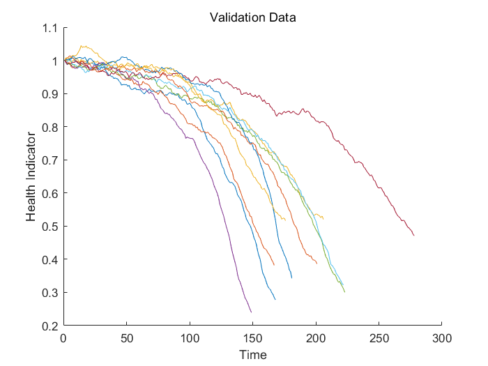
第七步:构建相似性模型
现在,可以使用训练数据构建基于残差的相似性模型。在此设定中,模型尝试使用二阶多项式拟合每个融合数据
第i个数据和第j个数据的距离通过1-范数残差定义为:
d(i, j) = ||yj−ŷj, i||1
其中yj为第j台机器的健康因子,ŷj, i为使用第i台机器建立的二阶多项式模型在第j台机器上的健康因子估计值
相似性得分通过以下公式计算:
score(i, j) = e − d(i, j)2
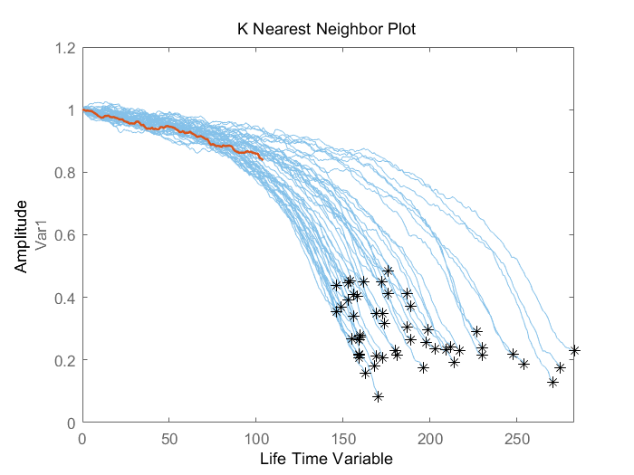
给定验证集中的一条数据,模型将寻找到训练集中最近的50条训练数据集结果。之后基于这50条数据集的结果做出概率分布,并使用分布的均值作为剩余寿命的估计值
第八步:模型评估
为评估相似性模型,使用50%、70%、90%数据量的验证数据来预测剩余寿命
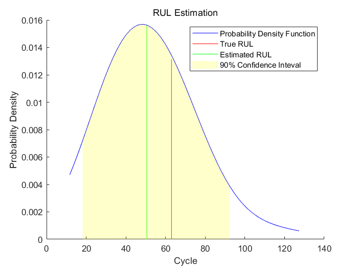
先使用该数据的前50%部分
然后可视化前50%部分的验证数据及其最近的训练数据
画出剩余寿命的真值、估计值的对比并给出估计值的概率分布
辅助函数helperPlotRULDistribution如下:
function helperPlotRULDistribution(trueRUL, estRUL, pdfRUL, ciRUL)
% HELPERPLOTRULDISTRIBUTION Plot RUL distribution
%
% This function supports the Similarity-based Remaining Useful Life
% Estimation example. It may change in a future release.

%  Copyright 2017-2018 The MathWorks, Inc.

hold on
plot(pdfRUL.RUL, pdfRUL.ProbabilityDensity, 'b');
idx = find(pdfRUL.RUL > trueRUL, 1, 'first');
if isempty(idx)
    y = pdfRUL.ProbabilityDensity(end);
else
    y = pdfRUL.ProbabilityDensity(idx);
end
plot([trueRUL, trueRUL], [0, y], 'r');
idx = find(pdfRUL.RUL > estRUL, 1, 'first');
if isempty(idx)
    y = pdfRUL.ProbabilityDensity(end);
else
    y = pdfRUL.ProbabilityDensity(idx);
end
plot([estRUL, estRUL], [0, y], 'g');
idx = pdfRUL.RUL >= ciRUL(1) & pdfRUL.RUL<=ciRUL(2);
area(pdfRUL.RUL(idx), pdfRUL.ProbabilityDensity(idx), ...
    'FaceAlpha', 0.2, 'FaceColor', 'y', 'EdgeColor', 'none');
hold off
legend('Probability Density Function', 'True RUL', 'Estimated RUL', '90% Confidence Inteval');
xlabel('Cycle')
ylabel('Probability Density')
title('RUL Estimation')
end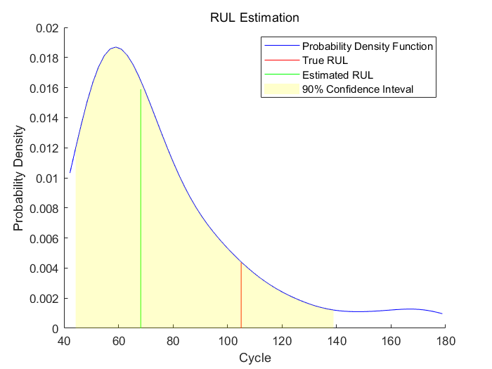
可以看出,当机器处于中等健康状态时,剩余寿命的估计值和真值之间还存在一定较大误差。本案例中,最相似的10条曲线在一开始表现得很近,但在它们接近失效时,曲线分叉成了两股,也就造成了剩余寿命估计值的分布粗略的有两种模式
之后使用第二个断点,即使用验证数据的前70%数据
bpidx = 2;
validationDataTmp70 = validationDataTmp(1:ceil(end*breakpoint(bpidx)), :);
trueRUL = length(validationDataTmp) - length(validationDataTmp70);
[estRUL,ciRUL,pdfRUL] = predictRUL(mdl, validationDataTmp70);

figure
compare(mdl, validationDataTmp70);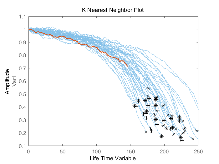
当数据量增加时,剩余寿命的预测也就更准确
最后使用90%的断点,即验证数据的前90%验证模型
bpidx = 3;
validationDataTmp90 = validationDataTmp(1:ceil(end*breakpoint(bpidx)), :);
trueRUL = length(validationDataTmp) - length(validationDataTmp90);
[estRUL,ciRUL,pdfRUL] = predictRUL(mdl, validationDataTmp90);

figure
compare(mdl, validationDataTmp90);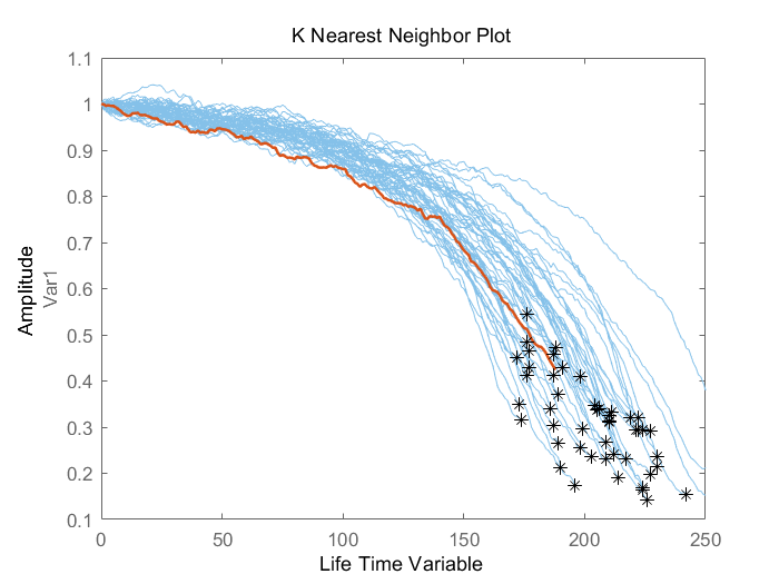
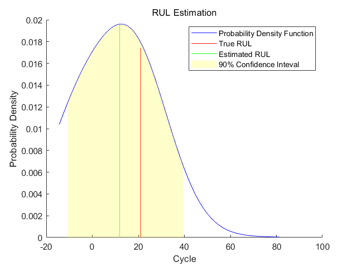
当机器临近于失效时,剩余寿命的预测结果又比70%时更准确
现在对整个验证集数据重复相同评估过程,并对每种断点情况计算剩余寿命的估计值和真实值的差
numValidation = length(validationDataFused);
numBreakpoint = length(breakpoint);
error = zeros(numValidation, numBreakpoint);

for dataIdx = 1:numValidation
    tmpData = validationDataFused{dataIdx};
    for bpidx = 1:numBreakpoint
        tmpDataTest = tmpData(1:ceil(end*breakpoint(bpidx)), :);
        trueRUL = length(tmpData) - length(tmpDataTest);
        [estRUL, ~, ~] = predictRUL(mdl, tmpDataTest);
        error(dataIdx, bpidx) = estRUL - trueRUL;
    end
end
可视化对每种断点,它所对应的预测误差概率分布柱状图
[pdf50, x50] = ksdensity(error(:, 1));
[pdf70, x70] = ksdensity(error(:, 2));
[pdf90, x90] = ksdensity(error(:, 3));

figure
ax(1) = subplot(3,1,1);
hold on
histogram(error(:, 1), 'BinWidth', 5, 'Normalization', 'pdf')
plot(x50, pdf50)
hold off
xlabel('Prediction Error')
title('RUL Prediction Error using first 50% of each validation ensemble member')

ax(2) = subplot(3,1,2);
hold on
histogram(error(:, 2), 'BinWidth', 5, 'Normalization', 'pdf')
plot(x70, pdf70)
hold off
xlabel('Prediction Error')
title('RUL Prediction Error using first 70% of each validation ensemble member')

ax(3) = subplot(3,1,3);
hold on
histogram(error(:, 3), 'BinWidth', 5, 'Normalization', 'pdf')
plot(x90, pdf90)
hold off
xlabel('Prediction Error')
title('RUL Prediction Error using first 90% of each validation ensemble member')
linkaxes(ax)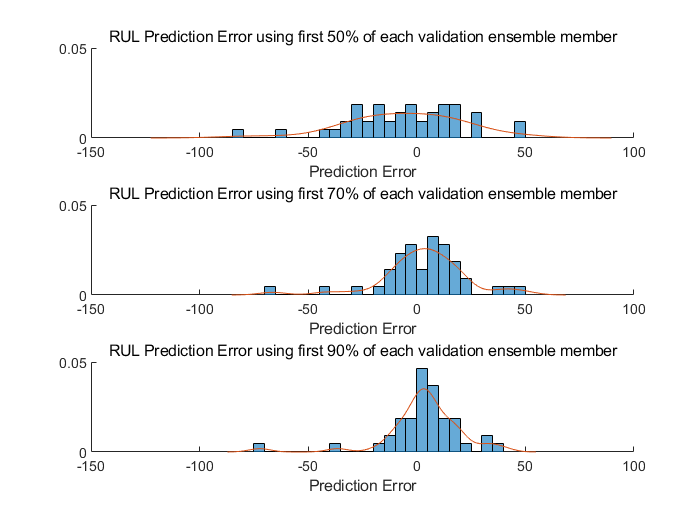
之后使用25-75为主部分的箱形图可视化预测误差,并给出均值及离群点分布
figure
boxplot(error, 'Labels', {'50%', '70%', '90%'})
ylabel('Prediction Error')
title('Prediction error using different percentages of each validation ensemble member')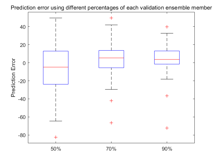
计算并比较预测误差的均值和标准差


对每种断点画出其估计误差和标准差范围
figure
errorbar([50 70 90], errorMean, errorSD, '-o', 'MarkerEdgeColor','r')
xlim([40, 100])
xlabel('Percentage of validation data used for RUL prediction')
ylabel('Prediction Error')
legend('Mean Prediction Error with 1 Standard Deviation Eror bar', 'Location', 'south')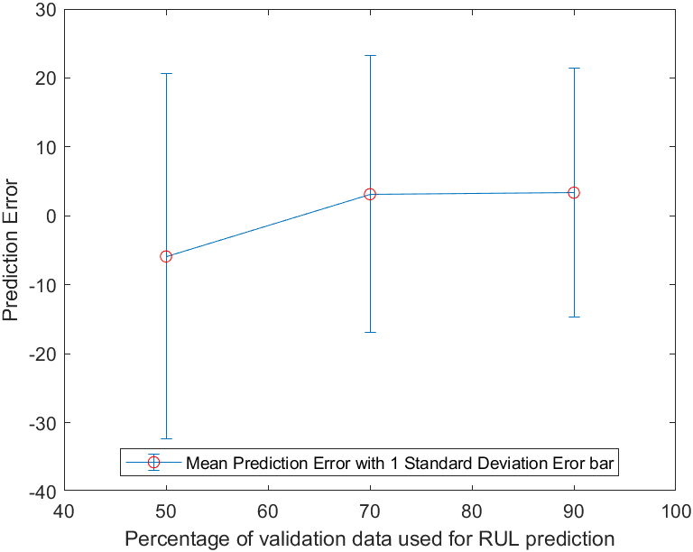
可以看出,当足够的数据可知时,预测的误差均值收敛于0附近
参考:https://ww2.mathworks.cn/help/predmaint/ug/similarity-based-remaining-useful-life-estimation.html